

 0800 987 1087
Contrast
There are many simple things that can make life with sight loss easier and safer. Poor lighting and glare can reduce remaining vision. Good use of colour contrast in your home can help.
Making better use of colour contrast in your home
Some people may lose the ability to see colours and tones. This makes it difficult to distinguish things.
Examples of good contrast include:
- painting “nosings” on stair edges
- painting doors so they stand out from the colour of the wall
- avoiding busy patterns on walls, carpets, and furniture
- preparing dark coloured food on a light coloured chopping board
- white crockery on a dark non-slip mat
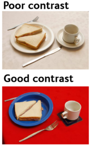
An example of poor contrast and good contrast. The poor contrast image shows a white bread sandwich on a white plate next to a white cup and saucer and silver cutlery. All are sitting on white tablecloth. The good contrast image shows a whit bread sandwich sitting on a blue plate next to a white cup on a black coaster and silver cutlery. All are sitting on a red table top.
For more information, contact Visibility Scotland on 0141 332 4632 or info@visibilityscotland.org.uk